Ferrero Rocher
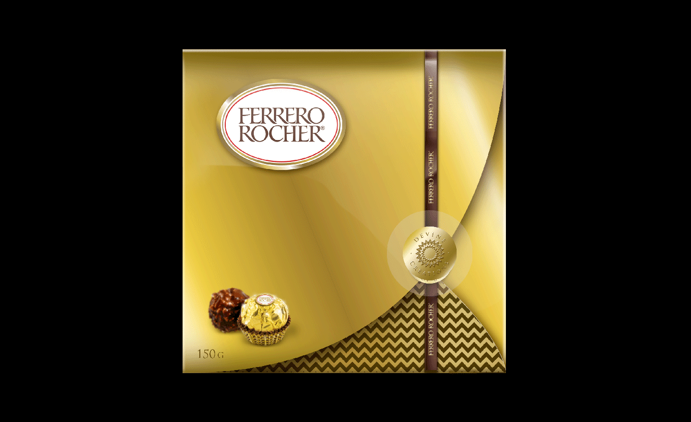
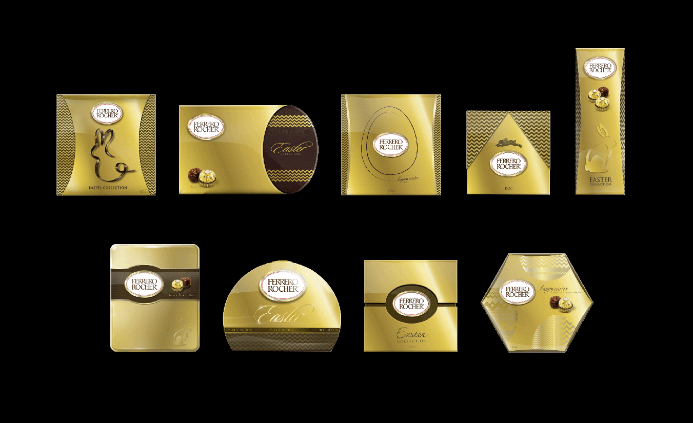
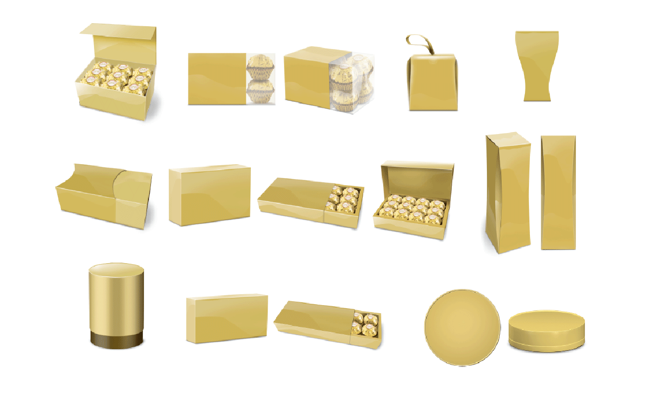
Ferrero Rocher required a chocolate box design that could be flat packed around the world and then assembled in each location. It needed to be able to withstand weight stacking and then arrive transported into store maintaining the perfect condition of the delicate Ferrero Rocher chocolate balls. The opportunity allowed the Australian market to have the iconic Ferrero Rocher chocolate image updated and a refresh pack design that included a graphic pattern that would become part of the brand’s visual DNA.
Project: Structural design, packaging, photography art direction, brand language, POS.


No Comments